Data visualization and visual analytics is one of the fastest growing disciplines in today’s increasingly data-driven world. With use cases spread across diverse domains — healthcare, policy, sports, governance, journalism, and more — data visualization is being used extensively by decision-makers to make important decisions in a fraction of seconds. After all, the story behind the numbers reveals far greater insights than the numbers themselves.
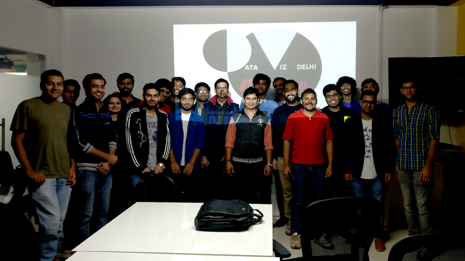
In November 2016, we brought together data viz enthusiasts across Delhi NCR to share thoughts and learnings, and thus was born the Delhi Data Viz Meetup Community.
The first Delhi Data Viz Meetup was held at our office in Saket, New Delhi, on 19th November, 2016. The aim of our first data visualization meetup was to put forth a strong case for data viz as a scientific discipline and its application across various industries.
Dharmik from the Atlan team introduced the agenda for the day, including insights into the world of data as it stands today. For example, did you know that 90% of the world’s data was generated in the last two years?
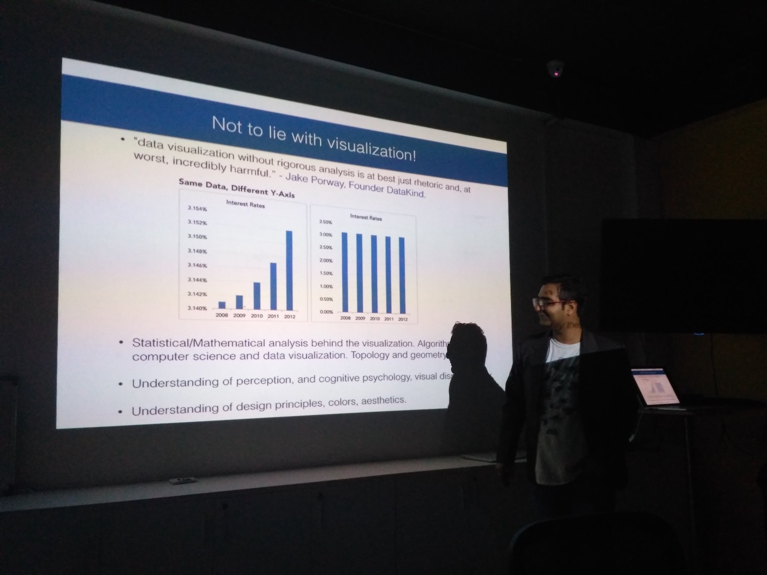
The first speaker for the day was Janu Verma, a researcher at IBM Thomas J. Watson Research Center in New York who currently works on the development of visual analytics systems for prediction and understanding. Before delving into visualizations, he explained how organizations currently approach big data — in massive tables or spreadsheets — and how dealing with data in this way just doesn’t work. Visual representations of data are far more memorable than raw numbers, plus they easily show trends and context in data that’s not easily visible in a data table. Because of this, data viz is playing an increasingly important role in data journalism, data for social good, machine learning, and many other fields.
Janu went on to share some amazing visualization examples — including countries that give visa on entry (and the ones that don’t), different paths to the White House, gun deaths in the United States, and every Lata Mangeshkar song. His talk then concluded with a discussion on what goes into a good, actionable data visualization, including insights from statistical analysis, cognitive psychology, and visual display theory.
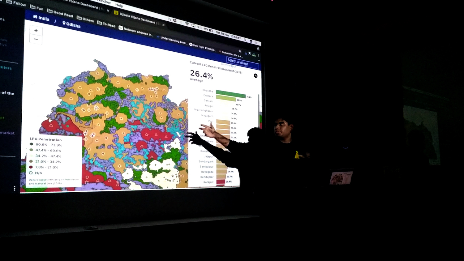
The second speaker for the discussion was our very own viz geek Krishna from the Engineering Team. He shared his learnings on visualizing diverse data sets and how these visualizations are used by a wide variety of data teams to drive important decisions every day.
The two most common questions Krishna faces are “What data needs to be included?” and “How should this data be visualized to help people reach a decision in a matter of seconds?” Design plays a critical role in making a dashboard actionable and effective. For example, Krishna spoke about the perceptions associated with different colors, the importance of using contrasting colors on maps with lots of markers, the value of clear visual icons for representing different types of locations or data, and how to create robust functionality in terms of queries, reports, and search without compromising on visual design.
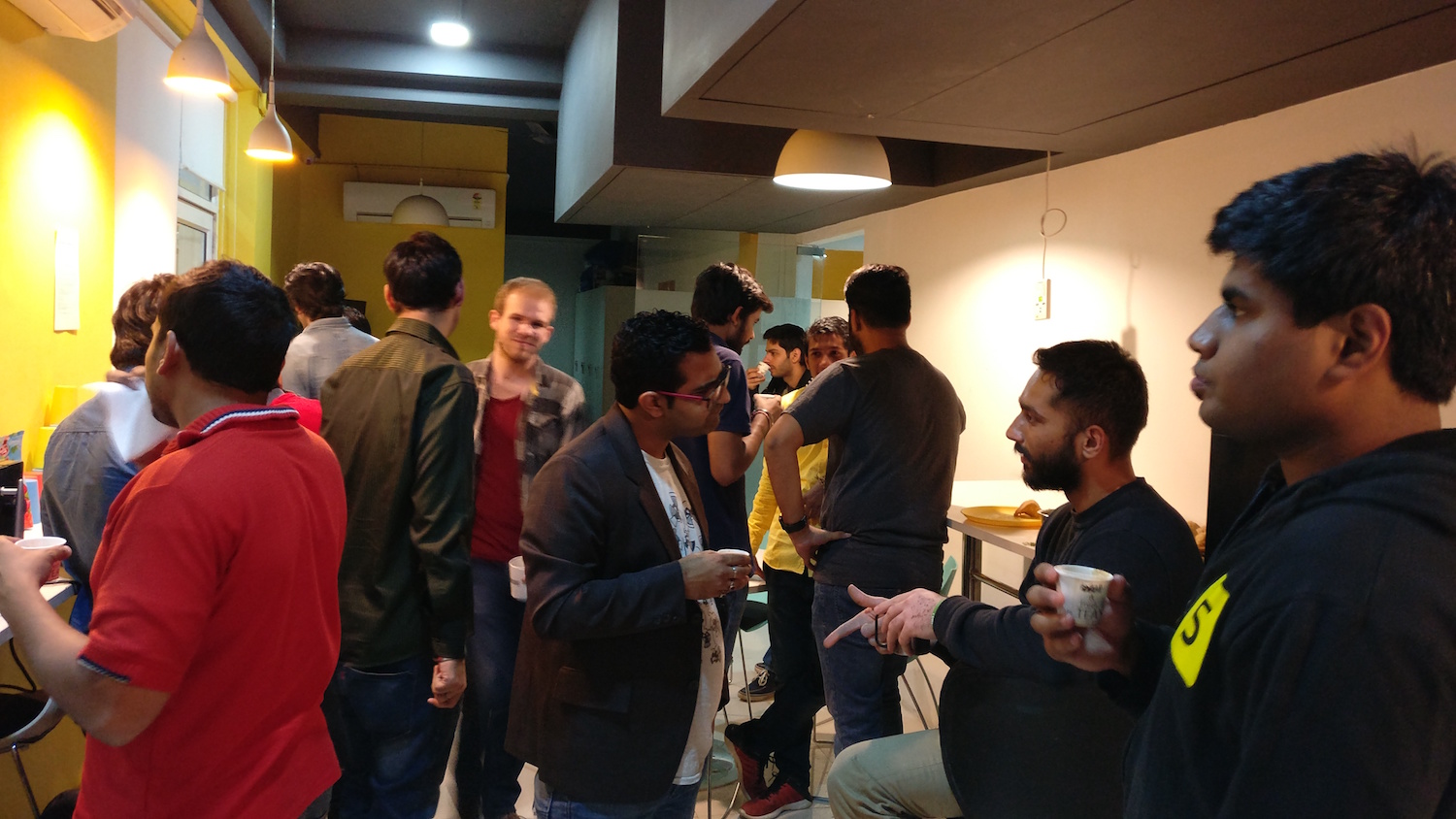
As the day neared an end, the meetup members discussed what data viz topics they would like to be featured in future meetups, as well as the possibility of including tutorial-based workshops, speakers from across domains, and hands-on data viz exercises.


